

Below is an excellent, current (about 2/15/11) snapshot of our national economy since the inauguration of President Obama (with Democrat control of both federal legislative bodies until this year). It seems that the goal of the table of figures is to disparage Barack — and well he’s earned it.
It appears that Dick Morris first publicized this table of comparisons. It was prepared by one Ruth S. King, but a quick Google search didn’t discover her source site.
BTW, I wish this snapshot table included the actual URL websites of the sources. That would be helpful both to verify the figures and to update them as time passes. From what I see of the numbers, they are indeed accurate.
To be fair, it should be pointed out that a fair amount of the decline since Obama took office (the undefined portion due to federal government policies) sits on the shoulders of Bush II — and both parties in Congress during the Bush tenure. There is a lag time from the point where policies (good or bad) are put in place and when we feel/see the consequences — intended or unintended.
But clearly the the current run-up of the money supply and the mushrooming increase in deficit spending is Obama’s baby. And so are the adverse future consequences still to come.
Obama et al justify their runaway stimulus spending with a lame rationale — “it would have been worse without our policies.” Of course, such an assertion is unprovable either way.
But what IS apparent is that Obama’s claimed improvements at the time of the stimulus package implementation did not come to pass — things got worse, not better (except perhaps for government employees — the primary beneficiaries of stimulus spending).
Obama is the poster child for the “Peter Principle” — rising to his level of incompetence. Oddly enough, I STILL predict he will be re-elected in 2012.
I hope I’m wrong.
———
Inflation and Unemployment.
Two years ago, Barack Obama was inaugurated as president of the United States.
The mainstream media does not cover the full extent of the damage the Obama Administration has inflicted on this country. Even FoxNews often doesn’t have the time to go into sufficient depth to explain what is happening.
From our friend Ruth S. King comes a chart which all of us should read and absorb, sobering though it may be:
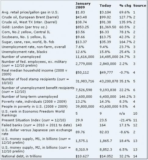
NOTE: To see this fuzzy image in crystal clear format, just click on the chart for a sharp picture. It usually works.
Just take this last item: In the last two years we have accumulated national debt at a rate more than 27 times as fast as during the rest of our entire nation’s history. Over 27 times as fast! Metaphorically, speaking, if you are driving in the right lane doing 65 MPH and a car rockets past you in the left lane 27 times faster . . . it would be doing 1,755 MPH!
(1) U.S. Energy Information Administration; (2) Wall Street Journal; (3) Bureau of Labor Statistics; (4) Census Bureau; (5) USDA; (6) U.S. Dept. of Labor; (7) FHFA; (8) Standard & Poor’s/Case-Shiller; (9) RealtyTrac; (10) Heritage Foundation and WSJ; (11) The Conference Board; (12) FDIC; (13) Federal Reserve; (14) U.S. Treasury
Comments 5
Nothing about the stock market being up 100% since Obama took office. I think everyone with a 401-K appreciates that.
A comparison of the dollar vs. the yen, but not one of the dollar vs. the euro. Not to mention that many exporting businesses would appreciate a weaker dollar.
Pick the commodity prices that are up, but exclude prices that are down.
No comparison of the numbers who lacked health insurance.
At least you were honest enough to say that the goal of the table was to disparage the President. It certainly wasn’t to provide an unbiased perspective.
The Dow Jones stock markert average was 8,077 on January 23, 2009, and it was 12,129 on Feb. 25, 2011, two years later. That is a 50% increase, not 100%.
Meanwhile, after Trillions in “stimulus” and other special Federal spending, the USA unempoyment rate is up from 7.2% in December of 2008, to 9.4% in December 2010 (most recent month available).
The actual unemployment rate is higher, since millions of Americans have stopped looking for work in such a hostile economy.
This might have SOMETHING to do with Republicans gaining 63 House seats last November, and taking the governorships of Michigan, Ohio, Wisconsin, Iowa,
Pennsylvania, New Jersey, New Mexico and Florida…all of which had voted for President Obama in 2008.
Jim,
The stock market is up 100% from its low, but you are correct in that it is only up 50% since the day Obama took office. Still, don’t you think the market being up 50% would have been mentioned in an objective chart?
Author
As I mentioned in posts before, the previous President deserves major credit or blame for the first year to 18 months of the NEW President’s term of office. There is a lag from the time policy is passed, and when its effect is felt. It’s a common error of analysis by pundits and partisan parties alike.
Hence, to the extent the stock market rally IS related to a President’s actions (and that itself is an unmeasurable factor among many factors), clearly Bush II rates most of the credit.
The problem for Obama is he told us how effective his stimulus was going to be (especially bringing down unemployment), and it turned out he was VERY wrong. He needs refresher instruction on reining in his hubris.
Richard,
By your way (18 -month rule) of thinking, Bush II is responsible for unemployment reaching 10% and Obama would be responsible for bringing it back down to 9%. Maybe that stimulus really was effective 🙂